

End to End UX Designer
(Research, Ideation, Prototyping, Testing, and Iteration)
Role:
Timeline:
4 weeks
Tools:
Figma, Figjam, Google Workspace
Overview
Designing for Spontaneous Lives
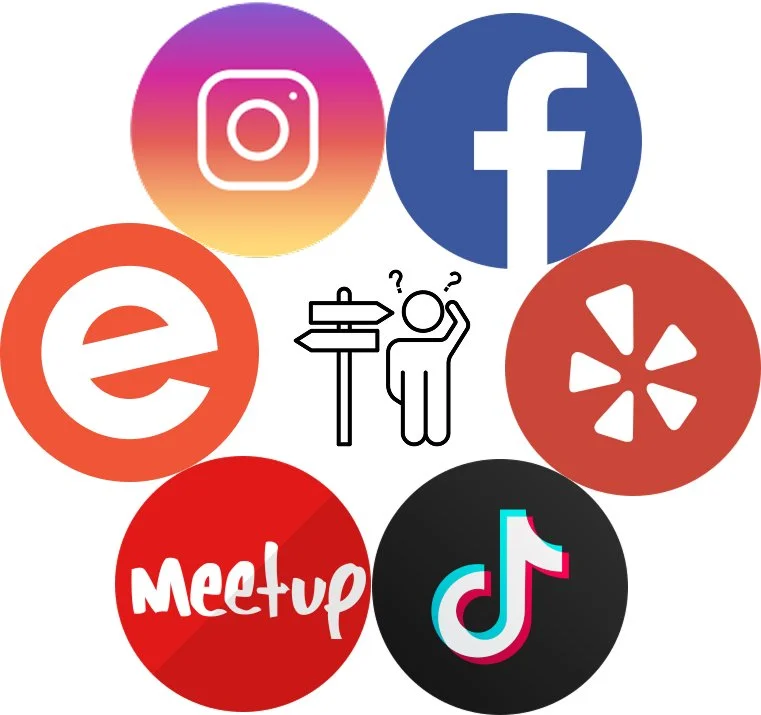
In today’s world everything is fast paced. Discovering local events often relies on catching the right Instagram reel or TikTok at the right time and if not then the opportunity might of just passed by. But what if your map could do that for you?
The Live Events layer added in Google Maps solves a common frustration: fragmented event discovery. This feature helps users find nearby events based on time, price, and crowd levels all within a tool you already use and trust.
Problem
Missed Moments
People miss nearby events happening because discovery is scattered across Instagram, TikTok, Eventbrite, and word of mouth. Users bounce between apps and then arrive late or miss tickets for events (sold out).
What I heard from users:
“I end up bouncing between Instagram and Eventbrite, and still feel lost.”
“By the time I find out, tickets are sold out.”
“I always see the event after it’s already over.”
For Google, every missed event means fewer navigation starts, lost ad revenue, and another moment where users bounce to competitors instead of staying inside Maps. Maps is great at finding places but not at finding new moments.
Design Challenge: Help users find and act on events in under 60 seconds inside Google Maps while also creating engagement and revenue opportunities for Google.
Solution
One Layer, Many Moments
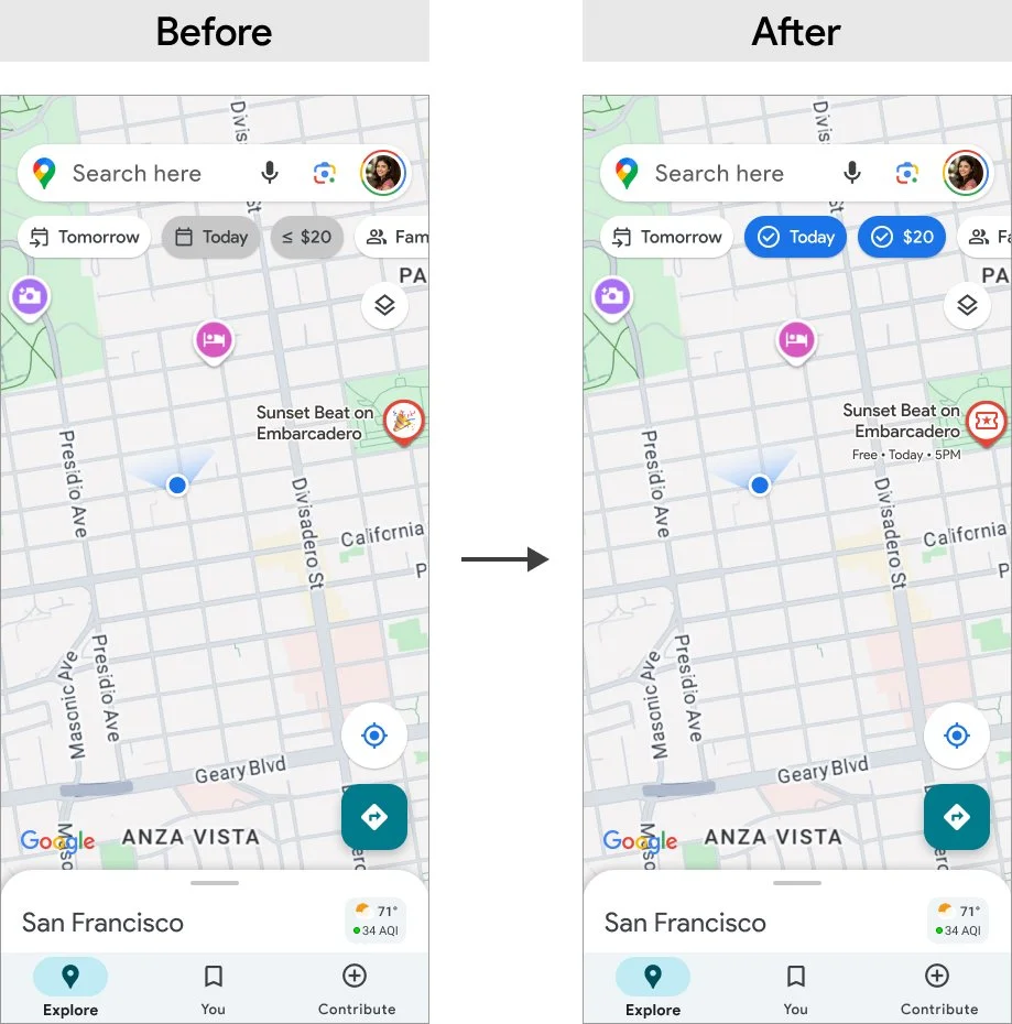
The solution is a toggleable Live Events layer inside Google Maps. Once enabled, it reveals real time pins for nearby events such as music, food, art, or family friendly.
Smart filters like “Today” or “≤ $20” let users refine results instantly. Tapping a pin opens a rich event card with time, price, and navigation options. In less than a minute, users can discover, decide, and go.

User Research
Understanding Missed Moments
I recruited six participants who regularly attend local events but often struggle to find them on time and miss out. To get accurate data I looked for a diverse group of students, professionals, and parents who use apps like Instagram, Eventbrite, or Maps to discover things to do.
My goal is to understand:
How people find local events?
What motivates them to go?
What makes the process frustrating or confusing?
These insights shaped the foundation of the Live Events feature and directly influenced the design goals, personas, and user flow that followed.
Key Insights:
People jump between multiple apps and tabs just to find one thing to do.
Price and timing are top decision factors
Sharing plans usually happens through messy screenshots.
They want less noise and more clarity.
With great feedback from the participants during research I was able to organized findings using affinity mapping to group frustrations, motivations, and discovery habits.


Personas
Three Personalities, One Shared Need
I was able to developed three core personas from the interviews and themes created in which they all had something in common. They all wanted a fast and low stress event discovery.

Olivia, 22 - Spontaneous student who hates missing out.

Yara, 30 - Planner who looks for clarity on price, vibe, and drive time.

Hersh, 39 - Parent who filters by cost, distance, and family friendliness.
User and Business Goals
Aligning Needs with Growth
In order to further understand the users, I looked at the problem from three angles, business, technical, and user. This allowed me a deeper guide on priorities to each department and how to approach their shared goals within my design.

Feature List
From Goals to Functionality
To meet both user and business goals, I prioritized a event layer button, quick smart filter, event cards, and remind me feature. These are features that directly tie user value to measurable engagement for Google.

User Flow
A Simple Path to Discovery
Before jumping into wireframes, I mapped the ideal user journey to ensure the feature felt simple and intuitive. The users wanted a quick solution and this gave me an idea how to structure the user flow catered to them.

Flow:
Open Google Maps
Tap Layers → Enable Live Events
Apply filters like Today and ≤ $20
Tap a pin to see event details
Navigate
This user flow anchored the design process while ensuring every screen supported the goal of finding and attending an event quickly.
Design
From Sketch To Structure
With the paper wireframes I explore early ideas for where filters, event pins, and cards could live on the screen. This gave me the freedom to sketch quickly and try different styles without overthinking the details.
I moved into mid-fidelity wireframes to test the overall flow to focus on actions like turning on the Live Events layer, applying filters, selecting a pin, and starting navigation. I then built the high-fidelity mockups using Google’s Material Design system, which brought a sense of polish and realism. This stage included adding filter pills and event category icons that made the experience feel a bit more complete and ready to use.


User Testing
What Worked and What Didn’t
I conducted moderated usability tests with five users representing students, professionals, and a parent. They completed all tasks successfully, from enabling the layer to starting navigation.
Some users missed the horizontal scroll on filter chips.
Event pins felt vague without categories.
Price needed to be visible earlier in the flow.
Feedback:
100% task success (25/25 tasks)
Median flow time: 53 seconds
Average SEQ rating: 4.2/5
Key metrics:

“This feels faster than Eventbrite.”
Design Iterations
Refining for Clarity
Based on user feedback, I made key changes:
Strengthened filter pills states with checkmarks and bold colors.
Added price tags directly on map pins.
Introduced icons for event categories (music, food, art, family)
Auto displayed the crowd meter.

Final Design
A Seamless Discovery Experience
The final version integrates live event discovery into the Google Maps ecosystem without disrupting familiar interactions. It empowers users to explore what’s happening now, whether they’re looking for a casual street fair or a late night music set.
Home mockup - Starting point on the familiar map.
Layers mockup - Toggle on the Live Events layer.
Live Events + Filters mockup - Refine results instantly with chips.
Event Card mockup - See time, price, and crowd at a glance, then start navigation.
The result is a fast, friendly, and functional solution that makes event discovery feel like second nature.

Product Success
100% task success
Average flow time: 53 seconds
SUS score: 84 (Excellent)
Every participant said they’d prefer this experience over Eventbrite or Instagram for discovery.
Impact Statement
Connecting User Value to Business Growth
The Live Events layer demonstrated how Google Maps could capture moments, not just places. In testing, participants completed tasks in under a minute, preferred it over Instagram or Eventbrite, and said they would actually use it on weekends. For Google, this meant a clear path to increasing weekend engagement and opening new revenue through tickets and ads.
Point of View (POV)
Designing for People and Business Together
My POV as a designer is that great features should solve real business problems while making life easier for users. By grounding this project in both user frustrations and business opportunities, I was able to design a solution that felt native to Google Maps, delivered delight for users, and aligned with business growth.
What I Learned
Designing for Real Behavior
This project really showed me how to quickly test assumptions, catch small pain points, and design while staying within system constraints. More importantly, it reminded me that UX has the biggest impact when it balances both user needs and business goals at the same time.
The biggest takeaway for me is to always check myself with one key question:
Does this help the user make a decision faster while helping the business grow?