
Role:
End-to-end UX/UI Designer,
UX Academy solo student project
Timeline:
12 weeks
Figma, Figjam, Google Workspace
Tools:
Designing for Busy Lives
We’re living in a time where learning is more accessible than ever but for busy adults, finding time to grow and upskill is still a real challenge.
Micro Boost was born out of a simple idea:
What if learning could be flexible to you instead of the other way around?
Background
Learning Shouldn’t Feel Like Another Chore
Adults want to keep learning but between work, family, and life, committing to long-form courses just isn’t realistic. Most learning platforms feel like a burden instead of a boost.
The problem was clear:
How might we create a learning experience that works with, not against, the lives of busy adults?
The problem
Learning That Fits Into Real Life
Micro Boost provides concise, interactive lessons intended to be completed within a short timeframe. The platform is designed to be flexible, accessible, and engaging, thereby fostering a positive and motivating learning experience.
By focusing on short content, clear navigation, and motivational features like progress tracking, Micro Boost helps learners stay on track, even on their busiest days.
The solution
Understanding Real-Life Learning Challenges
To get to the root of users' needs, remote interviews were conducted with busy adults trying to upskill. I conducted a competitive analysis to identify gaps in existing platforms and uncover potential opportunities.
User research
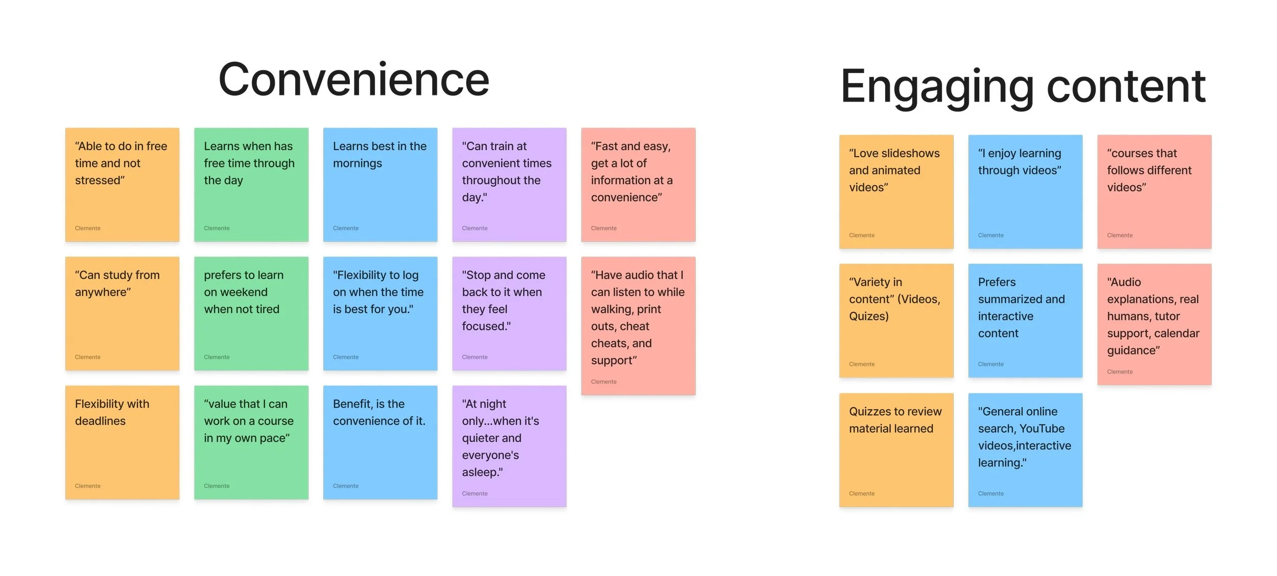
Affinity mapping revealed users crave learning that’s flexible, motivating, and friction-free.

Key Insights:
Learning needs to be flexible: Users want to fit learning into small pockets of time throughout their day and not commit to long sessions.
Short, engaging content is key: When lessons are too long, users lose interest quickly and stop returning.
Clarity reduces stress: A clean, intuitive interface helps users stay focused and avoid frustration or confusion.
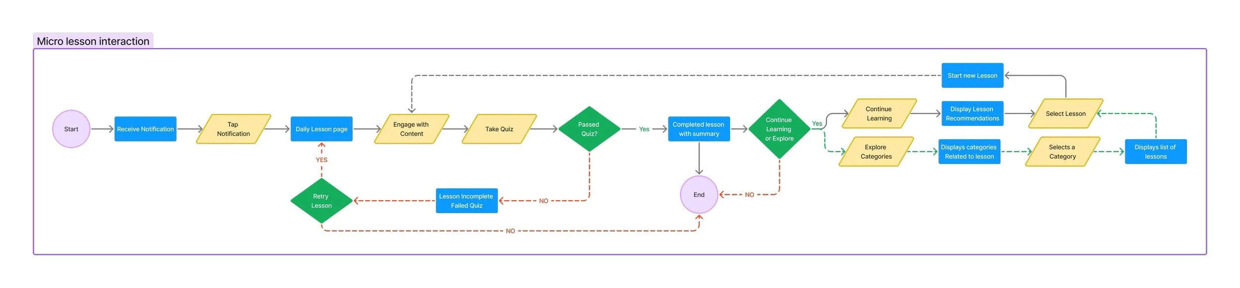
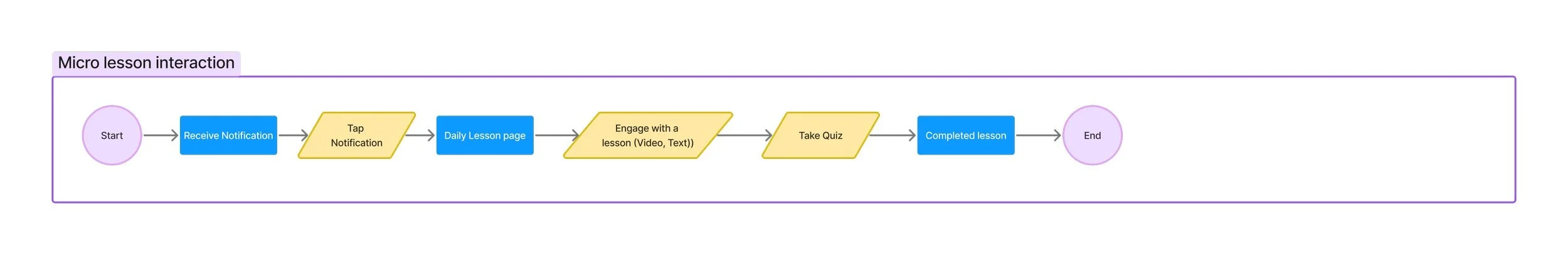
Mapping Out the Right Experience
Translated these insights into core design decisions as each step of the flow prioritized ease, speed, and clarity
Define
User Persona created based on goals and pain points.

"I need learning that adapts to my hectic schedule."
-Maya
User flows and Task flows created to focus on core tasks like starting a lesson based on how the users feedback.

Sitemap refined through card sorting, for clean navigation though the app
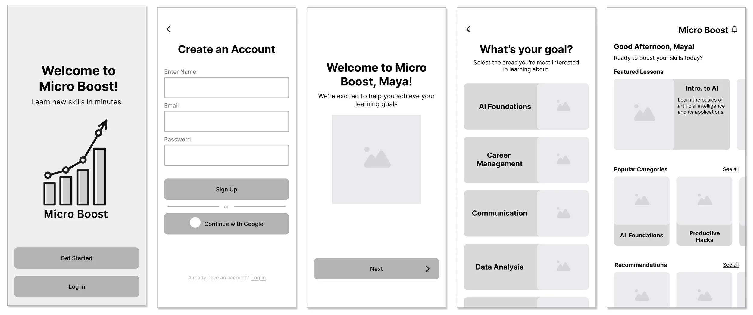
From Sketch to Polished Prototype
I sketched low-fidelity wireframes to test concepts quickly, then moved into mid-prototypes to refine the experience and visuals. These served as an initial tool for visualizing the user journey, from login to the completion of the first lesson. This iterative approach facilitated rapid idea exploration and refinement of the user flow, enhancing usability and intuitiveness.
Design


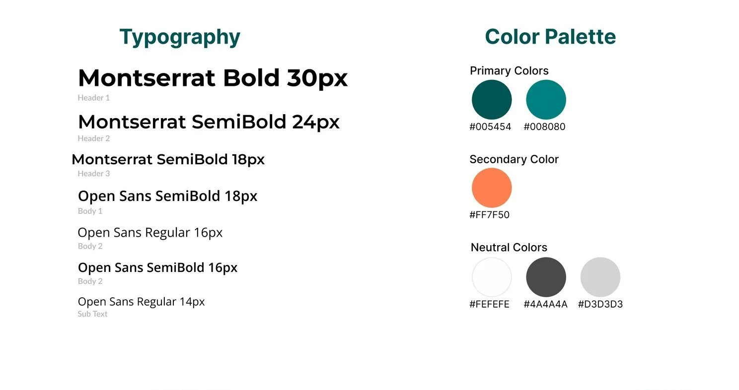
Branding Choices:
Colors: Energizing but minimal to keep users focused
Typography: Clean and bold for easy readability
Style: Professional, modern, and friendly — no fluff, just clarity
Listening, Testing, Iterating
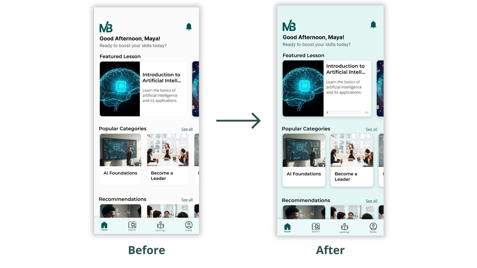
User testing was conducted with five participants, focusing on key workflows such as onboarding, lesson completion, and overall navigation. Insights gathered from participant feedback informed several design enhancements.
What I Improved:
Added progress indicators and completion checkmarks
Introduced bookmarks for saved lessons
Adjusted spacing and contrast for smoother visual flow
Usability testing

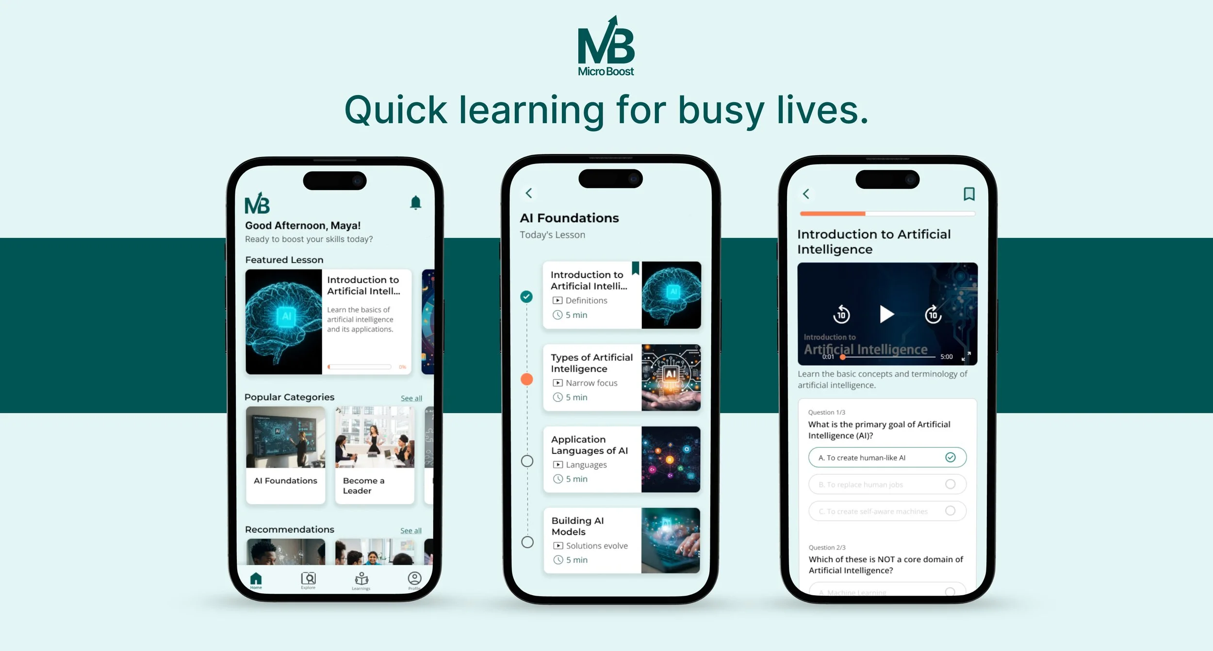
Simple, Smart, and User-Driven
The final Micro Boost prototype blends all user insights into a clean, motivating experience. It’s intuitive, focused, and actually fits into people’s busy lives — helping them learn without stress or friction.
Final prototype
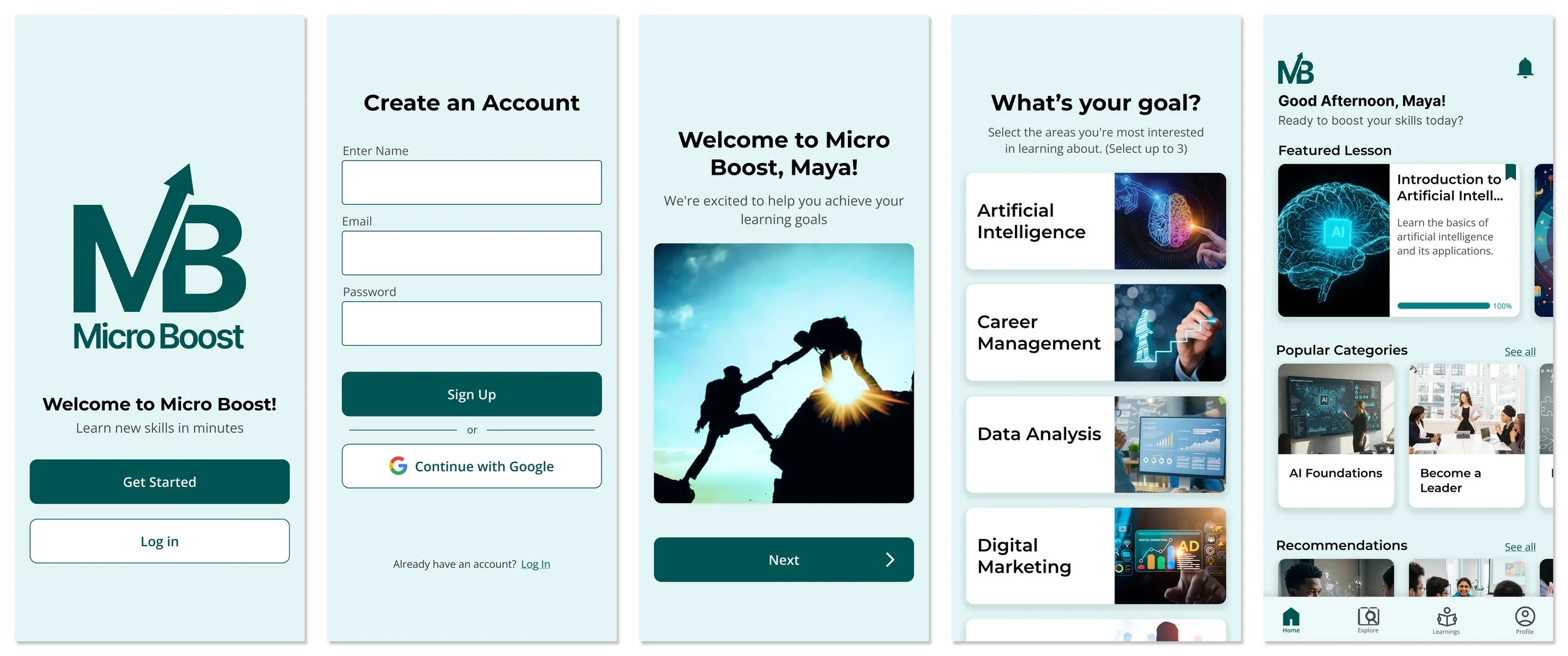
Signing up to access dashboard
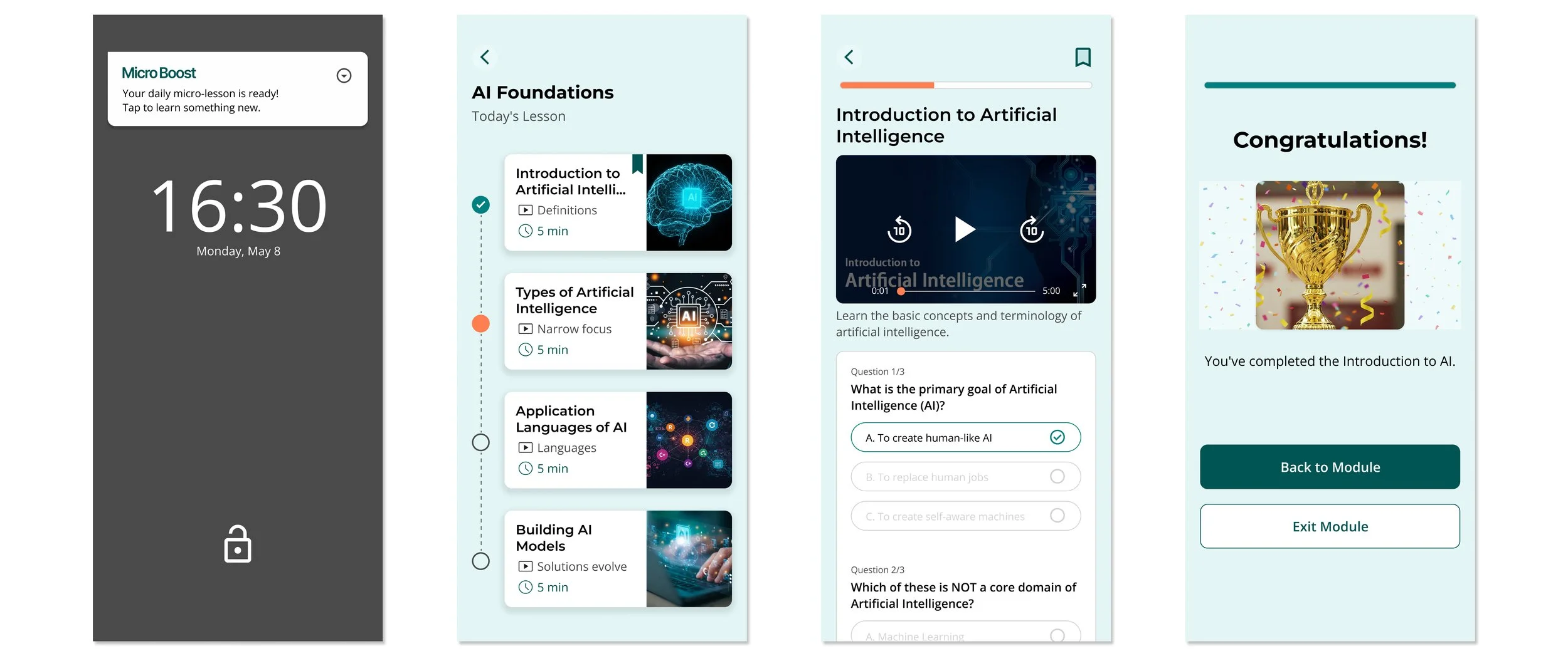
Notification to lesson completion
What I Learned
This project challenged me to find the balance between keeping the product lightweight and still delivering features that truly matter. Designing something that is both simple and motivating required thoughtful decisions at every step. I learned that great design begins with listening and really understanding users needs and frustrations. Iterating quickly based on user feedback helped me refine the product in meaningful ways. Throughout the process , I saw how powerful simplicity can be when it's backed by purpose and empathy.
What I’d Do Next:
Add personalized learning tracks
Build lightweight social/community features
My Biggest Takeaway:
Designing with empathy, testing early, and iterating fast made this project feel deeply connected to real users’ lives and that’s what I’m most proud of.